The Sunny theme 🌞
How a yellow guitar with a red racing stripe became this site's color scheme – six numbers, OKLCH and a few tricks.
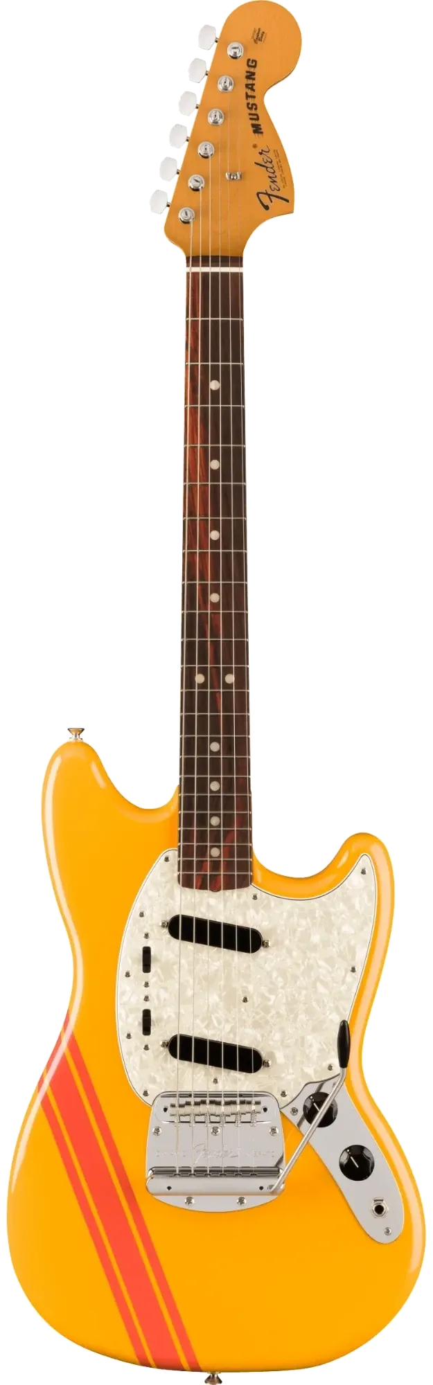
This site’s color scheme is called Sunny. It comes from my Fender Vintera II Mustang in Competition Orange with red racing stripes. Those two colors are the primary and the accent color. The stripe (thin, wide, then thin again, at 45°) shows up everywhere: in the logo, in the hero and at every job on the Experience page.
Six numbers
The whole theme hangs on six numbers: lightness, chroma and hue (OKLCH) for the primary and the accent color. Everything else is derived from them – backgrounds, text, borders and the palette above. Even the grays are tinted slightly towards the hue. Because the six numbers are registered as CSS properties (@property), the entire color scheme can change at runtime.
Light and dark
Every color is defined with light-dark() and follows color-scheme.
The site follows your system setting; the switch in the header overrides it.
Single sections can be pinned to one mode with the classes sunny-light or sunny-dark.
Every job in its own colors
On the Experience page, the color scheme switches to each company’s colors as you scroll. Brand colors come in every lightness, so they’re adjusted: light enough to stay readable on a dark background. When switching between two companies, the colors blend in OKLab instead of rotating the hue. That turns yellow to blue into a short, calm transition instead of a rainbow through red and pink. At the end of the page it returns to Sunny.
Fonts
Three fonts, three jobs: Fraunces for headings, Inter for body text and JetBrains Mono for details.
Fraunces
Brings the character. The font has two unusual axes: SOFT rounds off the
edges, WONK gives a few letters a slightly quirky shape. Both are turned all
the way up here. The result is a soft, round serif that recalls ’70s
advertising posters – the same era as the Mustang.
Inter
Stays in the background. For longer texts, readability matters more than personality, and Inter is built for exactly that: clear, calm and easy to read even at small sizes. Next to the playful Fraunces, it keeps things calm.
JetBrains Mono
Covers everything technical: date ranges, small labels, the prompt in the header (weblogixx@…) and, of course, code.
The monospace font recalls the terminal and the editor, and visibly sets metadata apart from the actual text.
On the technical side, a few deliberate choices:
- Self-hosted. The fonts come from this site itself, not from Google Fonts or any other service. There’s no request to third-party servers, and the privacy policy stays short.
- Variable fonts. One file per font covers all weights, and for Fraunces the
SOFTandWONKaxes too. - Latin character set only. It covers English and German, including ä, ö, ü and ß, and keeps the files small.
- No flicker. The files are preloaded (
preload), andfont-display: optionalkeeps the text from jumping once the font arrives. If you’ve been here before, the fonts are cached and show up right away. Only on a very slow first visit does that one page stay in the system font.